The Goosebumps series, written by R.L. Stine, captured the imaginations of young readers in the 1990s and continues to do so today. A significant part of its enduring success lies in the instantly recognizable and captivating book covers. These covers were primarily the work of artist Tim Jacobus, whose bold, eerie, and often surreal imagery played a massive role in drawing readers into the world of Goosebumps.
| Takeaway | Description |
|---|---|
| Exaggerated Perspectives and Surrealism | Jacobus’s use of exaggerated proportions and surreal imagery on Goosebumps covers created a sense of unease, distorting familiar elements like dolls or shadows to tap into the fear of the unknown. |
| Vivid Colors and Fearful Details | Bright, clashing colors combined with unsettling details hidden within the artwork made Goosebumps covers stand out and added to the overall feeling of unease, encouraging readers to explore the darker aspects of the illustrations. |
| Invitation to Fear | The covers acted as thrilling dares for young readers, signaling that Goosebumps stories offered scary fun rather than truly disturbing terror, serving as an accessible introduction to the horror genre and enticing children to experience spooky adventures. |
| Building Anticipation and Iconic Memorability | Each cover offered a tantalizing glimpse into the story, sparking readers’ imaginations and building anticipation for terrifying adventures. Jacobus’s consistent style across titles created a strong visual brand that remains iconic and memorable. |
| Legacy and Merchandising Impact | Jacobus’s cover art extended beyond the books, appearing on merchandise and influencing theme park attractions and TV adaptations. His distinctive style became synonymous with Goosebumps, attracting readers and creating dedicated fans. |
The Art of the Scare: Exaggerated Perspectives: The Goosebumps Distortion
Monsters and ordinary objects could be presented with enormous, impossible proportions. In “Night of the Living Dummy,” a ventriloquist’s dummy appears as tall as a house. This exaggerated scale doesn’t simply make things big; it throws off the viewer’s sense of reality, making the familiar frightening.
In covers such as “The Haunted Mask” and “Stay Out of the Basement,” Tim Jacobus often employs skewed camera angles, distorted perspectives of floors, and figures leaning in unnatural ways. These techniques induce a sense of vertigo, immersing the viewer as if they’re being drawn into the eerie world depicted on the cover.
Jacobus also skillfully utilizes foreshortening, a technique where objects closer to the viewer appear larger than those in the background. This artistic approach is evident in portrayals such as a colossal hand emerging from darkness in “The Curse of Camp Cold Lake” or the unnaturally elongated claws of a werewolf in “Werewolf Skin.” By employing foreshortening, Jacobus intensifies the visual impact, creating a heightened sense of threat and drawing the reader into a direct visual confrontation with the monstrous elements depicted.
Surrealism: When the Ordinary Turns Terrifying
Goosebumps covers often twist everyday objects, making them subtly wrong and therefore deeply disturbing. Dolls gain chillingly realistic expressions (“Night of the Living Dummy II”), masks seem to melt and fuse with faces (“The Haunted Mask”), and garden gnomes acquire wicked smiles (“Attack of the Mutant”). This taps into the fear that even the most familiar items can harbor a secret menace.
Ordinary objects undergo eerie transformations in Jacobus’s artwork: shadows morph into claw-like hands (“Monster Blood”), letters contort into monstrous shapes (“Say Cheese and Die!”), and a seemingly innocent cuckoo clock unveils a hidden skeleton. These instances serve as reminders that even the most benign items can harbor malevolent secrets.
Jacobus skillfully juxtaposes innocence with the grotesque. For instance, a serene child’s bedroom might be overrun by menacing swamp creatures (“How to Kill a Monster”), or a cheery bowl of food could transform into the lair of a terrifying insect (“Why I’m Afraid of Bees”). This stark contrast defies our expectations, unsettling viewers and evoking a sense of unease.
Vivid Colors: Fear in Technicolor
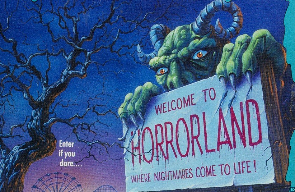
Instead of relying on traditional spooky colors like murky browns and shadowy grays, Goosebumps covers often feature clashing, almost garish color combinations. This makes them jump off the shelf. Even more importantly, the contrast between ‘childlike’ brights and the macabre imagery heightens the feeling of something being very wrong.
Neon greens, pinks, and oranges frequently highlight monstrous elements or unsettling details. This adds an almost radioactive, otherworldly glow, further separating the world of the Goosebumps covers from the everyday.
Jacobus’s reward for attentive readers were tiny, unsettling details. A monster reflected in a mirror, extra limbs tucked into the shadows, or grinning faces hidden in patterns create a sense of lurking evil just beyond the obvious horrors. Discovering these details makes the reader almost complicit in their own terror. It forces them into a position of actively seeking out the scariest bits, knowing that something disturbing awaits.
Impact on Readers: Invitation to Fear: The Cover as a Thrilling Dare
The covers clearly communicated that these were horror stories, but of a specific kind. The bright colors, over-the-top imagery, and a touch of the absurd hinted at scary fun rather than truly disturbing terror. This made the series accessible to younger readers who were ready for a safe introduction into the horror genre.
Goosebumps covers acted as a dare for young readers. They were a visual promise of chills, thrills, and the kind of fear that is secretly exciting. The covers suggested a world where encountering a spooky creature or bizarre situation wasn’t just possible, it was expected.
For many children, Goosebumps was their first real foray into scary stories. The covers were like a ticket booth outside a haunted house – promising a contained, temporary, and ultimately enjoyable experience in the realm of the spooky.
Building Anticipation: The Stoking of the Imagination
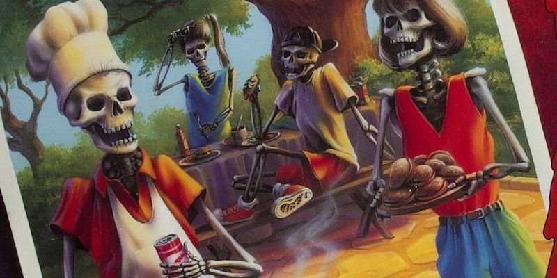
Each Goosebumps cover offered a tantalizing clue about the story within, but never the whole picture. A giant footprint, a shattered mirror with a monstrous reflection, a grinning mask – these act like movie trailers, sparking the reader’s imagination and making them eager to ‘see the rest of the film’ by reading the book.
Jacobus’s covers masterfully balance what is shown and what is deliberately concealed. This invites the reader to fill in the blanks, often with their own worst fears. Since the most terrifying things are often those only hinted at, the covers stimulate readers to imagine their own versions of the monsters lurking within.
The covers create a delicious tension. By offering a tempting glimpse into a terrifying world, they build both a fear of what lurks within the pages and an overwhelming desire to find out. It’s this tension that hooks a reader and compels them to keep turning those pages.
Iconic and Memorable: The Searing of a Generation’s Memory
The consistency of style across so many Goosebumps titles created a strong visual brand. Young readers could spot a new Goosebumps book instantly. This both drew them in and helped solidify the series as a cultural phenomenon.
The covers are time capsules to childhood for many. The imagery, the color palettes, and the unique Goosebumps font trigger vivid memories for those who grew up reading them. Even adults who haven’t thought about the series in years can instantly recognize and react to a classic Goosebumps cover design.
The blend of fear and excitement that the covers evoke is a powerful feeling, especially during childhood. Because of this, the imagery becomes inextricably linked to a specific period in a person’s life, making the covers deeply affecting even years later.
Beyond the Page: Merchandise Invasion
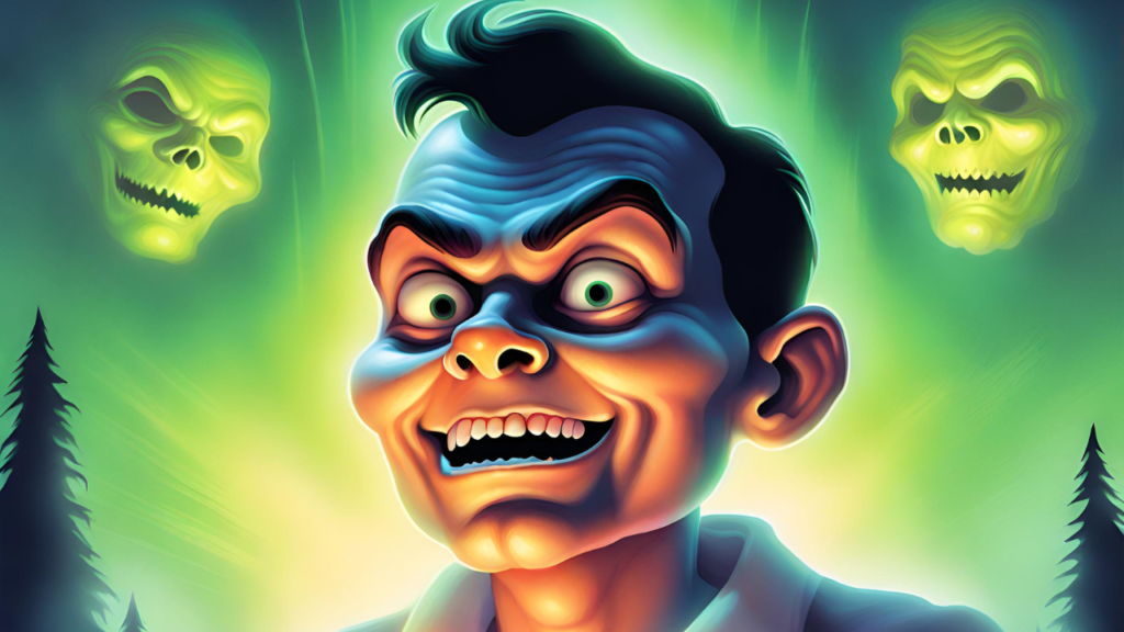
Goosebumps imagery appeared on everything a 90s kid could desire: t-shirts, backpacks, lunchboxes, stickers, trading cards, and even bed sheets! Seeing the same distinctive artwork across various products amplified the brand’s recognizability and made it feel inescapable and all-encompassing.
Items featuring the most striking or scary covers became highly desirable. Jacobus’s art turned the Goosebumps merch into mini pieces of collectible horror fun, creating ownership pride and further reinforcing a child’s connection to the brand.
The Small Screen Scare
The classic Goosebumps TV show intro incorporated the cover artwork in a dynamic and memorable way. Covers would zoom in, morph, or animate, accompanied by the show’s iconic eerie theme music. This ensured even viewers who weren’t readers were still exposed to the unique style of the Goosebumps world. Using the artwork in the intros seamlessly connected the series to the books, creating anticipation and excitement for fans and setting a suspenseful tone even before the episode’s story began.
Theme Park Thrills
Some theme parks featured Goosebumps-themed attractions, often entire haunted houses. These incorporated the artwork in large-scale ways, bringing the covers to life in a 3-dimensional environment. This allowed fans to physically step into the distorted, surreal world of the Goosebumps covers
Translating the cover art into physical experiences cemented the Goosebumps brand in children’s minds as something larger-than-life. It took the series from merely a book collection to a fully-fledged and terrifyingly fun universe.
Cohesive Visual Identity
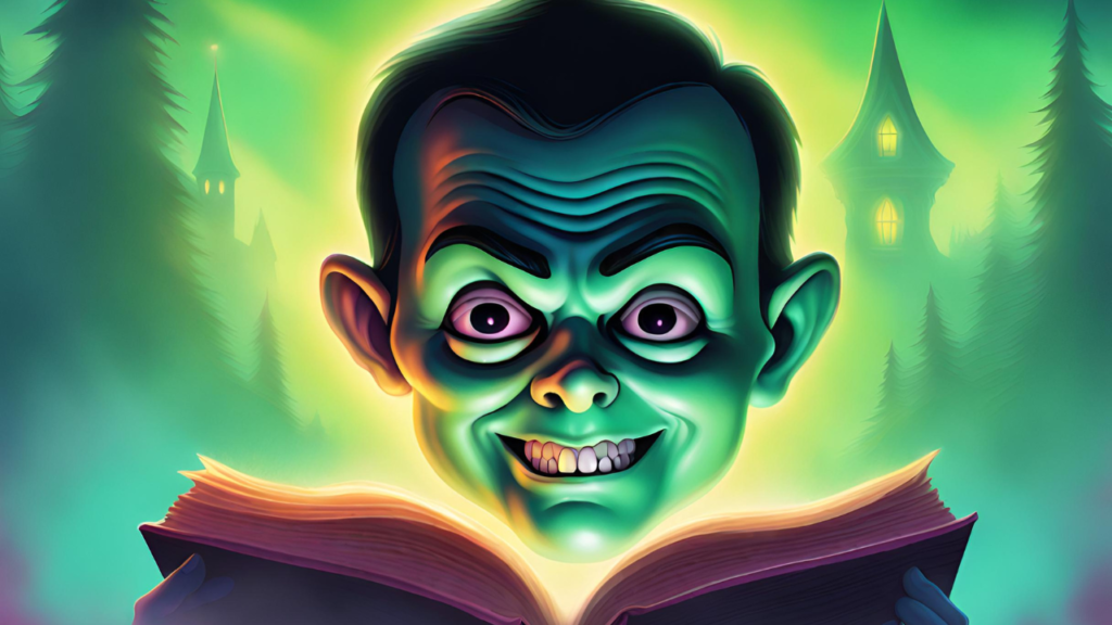
The consistent use of Jacobus’s style across different media created a unique and immediately recognizable visual identity for the Goosebumps brand. This allowed fans to spot new products or experiences associated with the series easily and further solidified the brand’s popularity.
The artwork became a sort of shorthand for the type of thrills Goosebumps offered. A child who saw a T-shirt with a Goosebumps cover immediately understood the kind of fun, spooky adventure associated with the brand, even if they hadn’t read the actual books.
The extension of the artwork into merchandise, television, and theme park attractions demonstrates the power of Jacobus’s designs. They were so effective at creating a specific mood and such clear representations of the brand, they successfully transcended their original use on the books to become integral parts of the larger Goosebumps phenomenon.
The Legacy of Tim Jacobus: The Power of Visual Storytelling
For many young readers, the cover was their first encounter with a Goosebumps book. Jacobus’s work became the face of the series, responsible for making a lasting first impression and creating an instant desire to crack the book open.
Jacobus had the unique ability to distill the essence of a Goosebumps story into a single, powerful image. Without relying on text or lengthy explanations, his covers could convey suspense, mystery, and the promise of chills, immediately drawing the reader into the story’s world.
The covers set the tone even before the reader encountered a single word of Stine’s writing. From the ominous color palettes to the unsettling details, Jacobus’s work created an immediate atmosphere of playful terror that became synonymous with the Goosebumps reading experience.

Attracting Readers, Creating Fans
The eye-catching nature of the covers, even those that were particularly scary, lured countless children into bookstores and libraries. Their bright colors and over-the-top imagery stood out, making them irresistible for young audiences browsing for something exciting.
The covers were designed to spark a reader’s imagination. The hints of lurking monsters and bizarre twists of fate found on the covers fueled anticipation for the story within the book, often causing readers to fill in the blanks with their own frightening scenarios.
Jacobus’s unique style was instrumental in creating dedicated fans of the series. Kids were eager to collect the books that featured the latest terrifying visuals, making Goosebumps a commercial and cultural phenomenon.
Unforgettable Part of Childhood
Goosebumps covers are indelibly linked to a specific era, invoking powerful nostalgia in those who grew up with the books. These images encapsulate both the thrills and the innocent fears of childhood, making them deeply evocative even decades later.
Jacobus’s work continues to inspire artists working in the realm of children’s horror and beyond. His bold, surreal style and ability to evoke both fear and delight in young audiences have left their mark on the world of visual storytelling.
While the covers are products of a certain time period, their core principles of impactful exaggeration, unsettling details, and a touch of the absurd give them staying power. They hold up as masterpieces of effective horror design, even for new readers.
Tim Jacobus’s legacy extends far beyond the pages of the Goosebumps books. His cover art ignited imaginations, fueled a love of reading for many children, helped establish the Goosebumps brand, and continues to be celebrated as a significant milestone in children’s illustration.

FAQ
| Question | Answer |
|---|---|
| Who created the cover art for the Goosebumps series? | Tim Jacobus is the artist behind the iconic cover art for the original Goosebumps series. His distinctive style played a significant role in defining the visual identity of the series. |
| What elements characterize Tim Jacobus’s Goosebumps covers? | Tim Jacobus’s covers often feature exaggerated perspectives, surreal imagery, vivid colors, and fearful details. These elements combine to create an atmosphere of unease and intrigue, drawing readers into the world of Goosebumps. |
| How did Tim Jacobus’s cover art contribute to the success of the Goosebumps series? | Jacobus’s cover art played a crucial role in attracting readers and building anticipation for each book. His distinctive style not only captured the essence of each story but also created a strong visual brand that remains iconic and memorable. |
| Did Tim Jacobus create the cover art for all Goosebumps books? | While Tim Jacobus illustrated the covers for the majority of the original Goosebumps series, there were a few exceptions where other artists were commissioned for specific titles. |
| What impact did Tim Jacobus’s cover art have on readers? | Jacobus’s cover art invited readers to explore the darker aspects of the stories while also offering a thrilling introduction to the horror genre. The covers sparked readers’ imaginations, building anticipation for the terrifying adventures that awaited them within the pages of each book. |
| Has Tim Jacobus’s cover art influenced other media related to Goosebumps? | Yes, Tim Jacobus’s distinctive style has extended beyond the books to influence various merchandise, theme park attractions, and television adaptations associated with the Goosebumps brand. |
| Are there any specific techniques or strategies Tim Jacobus used in creating Goosebumps covers? | Tim Jacobus employed a range of techniques, including exaggerated perspectives, surreal imagery, and vivid colors, to create covers that both intrigued and unsettled readers. His use of subtle details hidden within the artwork added layers of complexity to each cover, encouraging readers to delve deeper into the stories. |

[…] Stine’s Goosebumps series unleashed a wave of deliciously spooky adventures for young readers in the 1990s. From haunted […]
[…] Goosebumps excelled at featuring kids just like its readers. They weren’t superheroes or extraordinary geniuses; they were average kids dealing with typical kid problems like bullies, moving to a new town, or sibling rivalry. This made the extraordinary events they encountered seem even more shocking and frightening because it felt like they could happen to anyone. […]
[…] Goosebumps books targeted the pre-teen/young teen crowd. Those years are filled with specific anxieties growing up brings – changing bodies, social awkwardness, and new responsibilities. Movies need to keep the scare accessible to both adults and kids, often going for more universal, archetypal fears (clowns, ghosts, etc.). […]
[…] “A Night in Terror Tower” cleverly weaves real historical figures and events into its supernatural plot. You’ll encounter sinister knights, restless monarchs, and even the infamous executioner of the Tower of London – history brought to life with a terrifying twist! […]